Uniwallet App
Uniwallet App
Case Studies
Case Studies

My Role
UX UI Designer
Type
SaaS
Tools
Figma, UXtweak
Timeline
Dec-Feb 2026
•
Mobile
•
Product
•
System Design
Overview
Overview
Managing money isn’t the hard part
BUT understanding it is. 😨😥
Managing money isn’t the hard part BUT understanding it is. 😨😥
Managing money isn’t the hard part
BUT understanding it is. 😨😥
This project explores how a digital wallet can move beyond transactions and help users build real awareness of their financial behavior.
This project explores how a digital wallet can move beyond transactions and help users build real awareness of their financial behavior.
Why I decided to do this case stuides
Why I decided to do this case stuides
Most digital wallets make payments effortless, but they fail to show users where their money actually goes. Transactions happen instantly, yet spending remains invisible until it becomes a problem.
Most digital wallets make payments effortless, but they fail to show users where their money actually goes. Transactions happen instantly, yet spending remains invisible until it becomes a problem.
The Problem
The Problem
Users don’t struggle to make payments, BUT they struggle to understand their spending over time with multiple apps.
Users don’t struggle to make payments, BUT they struggle to understand their spending over time with multiple apps.
Users don’t struggle to make payments, BUT they struggle to understand their spending over time with multiple apps.
Small, frequent purchases go unnoticed that hard to track
Transaction lists provide data, but not meaning or prevention of wrong input
International transfers are often realized overcharge fees too late
Small, frequent purchases go unnoticed that hard to track
Transaction lists provide data, but not meaning or prevention of wrong input
International transfers are often realized overcharge fees too late

Key Insights
Key Insights


Users' lack of visibility and predictability. SO they need clarity and awareness. 🤔
Users' lack of visibility and predictability. SO they need clarity and awareness. 🤔
Users' lack of visibility and predictability. SO they need clarity and awareness. 🤔
Through user research and competitive analysis (Wise, PayPal, and Cash App), several patterns emerged:
Users don’t review every transaction; they only look for the total amount
Users rely on multiple accounts and payment methods, making it difficult to track total spending
Awareness comes too late, after the international transfer is already deducted
Unclear fees and exchange rates create uncertainty, reducing trust and confidence
Design Approach
Design Approach
The goal was not to add more features but to shift how information is presented.
“How can we help users understand their spending instantly?” 🧐
The goal was not to add more features but to shift how information is presented.
“How can we help users understand their spending instantly?” 🧐

Design Process
Design Process
Persona
Persona

Jenny Kim
Age: 25
Boston, USA
International student from Colombia studying Business Administration.
International student from Colombia studying Business Administration.
She uses multiple bank accounts and apps to manage tuition, rent, and daily expenses in both USD and COP.
She uses multiple bank accounts and apps to manage tuition, rent, and daily expenses in both USD and COP.
Needs transparent fees, low-cost transfers, and a simple way to track spending while studying abroad.

Marco Alverez
Age: 32
Traveling
Freelance content creator and remote worker
He pays for accommodations, food, and services in different currencies while managing income from international clients.
He pays for accommodations, food, and services in different currencies while managing income from international clients.
Needs fast, secure transfers, real-time exchange rates, and easy card control to manage spending while on the move.
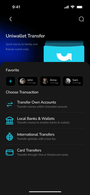
User Flow
User Flow

Wireframe
Wireframe

Card Sorting
Card Sorting
From card sorting with 6 participants living abroad by using the UXtweak platform, I shared the study with friends who frequently live abroad and regularly transfer money internationally.
From card sorting with 6 participants living abroad by using the UXtweak platform, I shared the study with friends who frequently live abroad and regularly transfer money internationally.
From card sorting with 6 participants living abroad by using the UXtweak platform, I shared the study with friends who frequently live abroad and regularly transfer money internationally.
Sitemap
Sitemap
Their input helped reveal how users naturally group financial features and label categories, which directly informed the sitemap and navigation structure of the app.
Their input helped reveal how users naturally group financial features and label categories, which directly informed the sitemap and navigation structure of the app.
Their input helped reveal how users naturally group financial features and label categories, which directly informed the sitemap and navigation structure of the app.
Early Design
Early Design
Mid-fidelity prototypes for usability testing.
Mid-fidelity prototypes for usability testing.


Usability Testing
Usability Testing

Scenarios
Scenarios
Use quick transfer from homepage
Check remaining budget
Manage card (freeze/unfreeze, limits)
Complete international transfer
Use quick transfer from homepage
Check remaining budget
Manage card (freeze/unfreeze, limits)
Complete international transfer
Use quick transfer from homepage
Check remaining budget
Manage card (freeze/unfreeze, limits)
Complete international transfer
Findings
Decision friction from overlapping actions
3/4 users confused by “Send” vs “Transfer”Low visibility reduces spending awareness
Users want clear remaining budget during useUnclear input flow reduces confidence
Users need editable inputs and a review step before sending
Decision friction from overlapping actions
3/4 users confused by “Send” vs “Transfer”Low visibility reduces spending awareness
Users want clear remaining budget during useUnclear input flow reduces confidence
Users need editable inputs and a review step before sending
Selected a real scenario and participants

Findings
Decision friction from overlapping actions
3/4 users confused by “Send” vs “Transfer”Low visibility reduces spending awareness
Users want clear remaining budget during useUnclear input flow reduces confidence
Users need editable inputs and a review step before sending
Selected a real scenario and participants
Iteration Design
Iteration Design
Why I made this decision


Iteration Screens & Prototypes
Iteration Screens & Prototypes
Mid-fidelity prototypes for usability testing.

What I Learned
This project reinforced the importance of grounding design decisions in real user behavior rather than assumptions. Conducting card sorting and usability testing early helped uncover navigation confusion and feature overload that would have been difficult to identify otherwise. I learned that clarity and transparency, especially around budgets, fees, and transfers, are critical to building trust in financial products.
THANK YOU!
Thanks for taking the time to explore this project.
I’m always open to feedback and would love to hear your thoughts.
“If you’re interested, feel free to dive into the next project.” 😍🤩
THANK YOU!
Thanks for taking the time to explore this project.
I’m always open to feedback and would love to hear your thoughts.
“If you’re interested, feel free to dive into the next project.” 😍🤩
Thank You for
visiting my site.
Socials


Have any Question? Feel free to reach out on LinkedIn or Email me: yimpanhchakporreaksmey@gmail.com
Copyrights © 2026 Yim All Rights Reserved
Thank You for
visiting my site.
Socials
Have any Question? Feel free to reach out on LinkedIn or Email me: yimpanhchakporreaksmey@gmail.com
Copyrights © 2026 Yim All Rights Reserved
Thank You for
visiting my site.
Socials
Have any Question? Feel free to reach out on LinkedIn or Email me: yimpanhchakporreaksmey@gmail.com
Copyrights © 2026 Yim All Rights Reserved